SENSYS TECHNOLOGY GROUP REBRAND
SUMMARY
My initial role at SenSys Technology Group was to redesign the brand from the ground up. This was an interesting, demanding project that evolved into many different avenues. My main task was to re-imagine SenSys as a holding company of eight smaller, companies. That felt distinct enough to stand on their own legs, but with a planned cohesiveness.
I created a brand that is striking, bold and memorable.
PROBLEM
The initial problem was future proofing a basic design. Colours, distinctiveness, iconography, visibility and an adaptable design system were all considered.
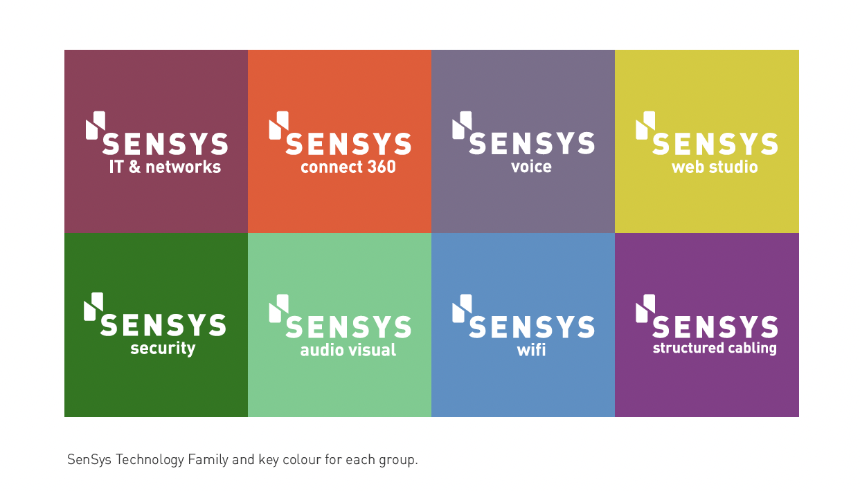
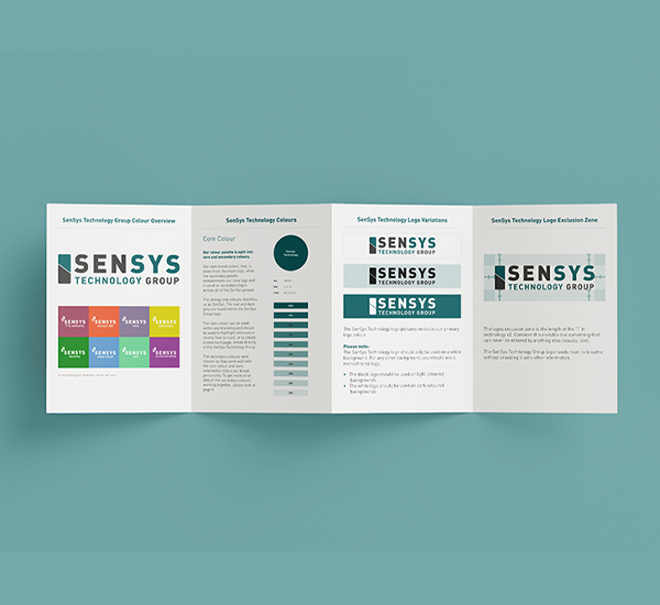
CHOOSING COLOURS
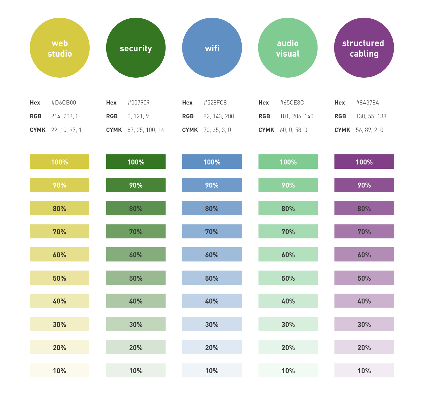
Keeping in mind that each of the 8 areas needed an identifiable colour. Each colour needs to be able to stand on its own, but still stay complimentary to the SenSys Technology ‘Teal’.
Each colour also had to be accessible and pass through checks. Such as the below, to ensure that they are visible to the most amount of people, while still being their own selves. Colours went back and forth between the teams until I was happy with the choices.

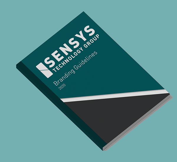
BRANDING GUIDELINES
With the colours approved, it was time to move on to creating the branding guidelines. The old SenSys Technology guidelines needed a complete overhaul. The main aim of the guidelines was to set out a strong foundation that could build as the company grows.
See Designing InHouse for icon development. I worked on the icons in tangent, for a separate project attached to SenSys Technology Group.
With an array of colours, icons and fonts chosen, the project came together quickly.
EXAMPLES
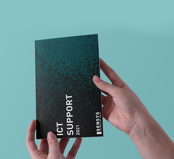
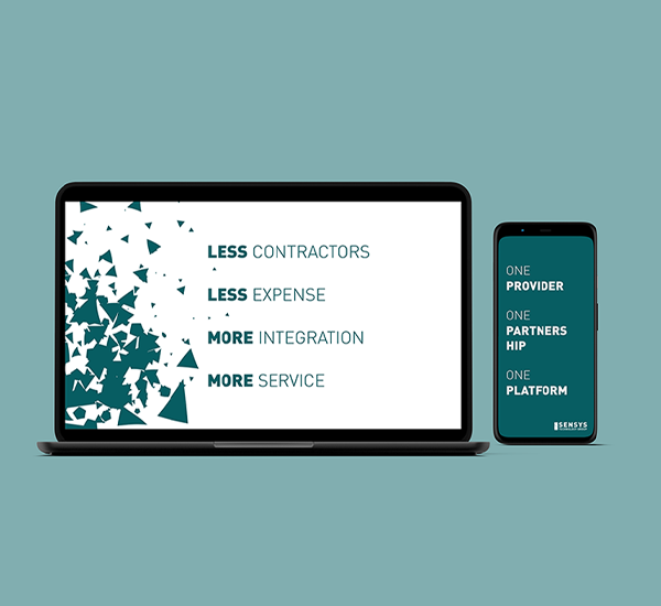
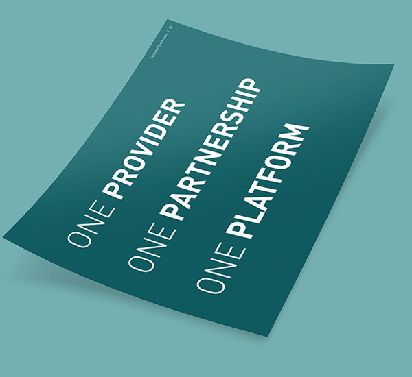
With the brand guidelines, the SenSys visual identity has evolved. This is easy to see in literature sure overview brochures, proposals and RFPs. It was also expanded on for the re-designed SenSys Technology websites.

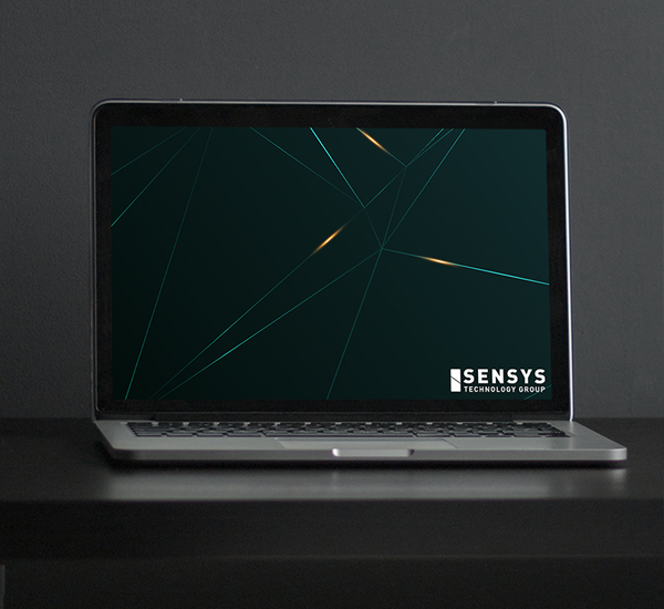
BOLD DESIGN
I wanted the design for SenSys Technology to have a) A bit of technology and b) a bit of fun to its design.

DESIGN SYSTEMS
The next step was to create many assets that the sales and marketing team could use to remain on brand. My aim was to make everything as clear and concise as possible. No matter the level of design literacy a person has. For example, making templates that Salesforce can adapt. Or, creating a library of design-ready assets for web development. These measures have been invaluable for a cohesive identity.


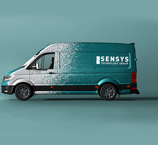
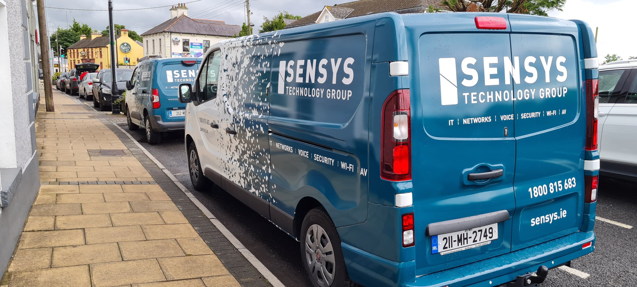
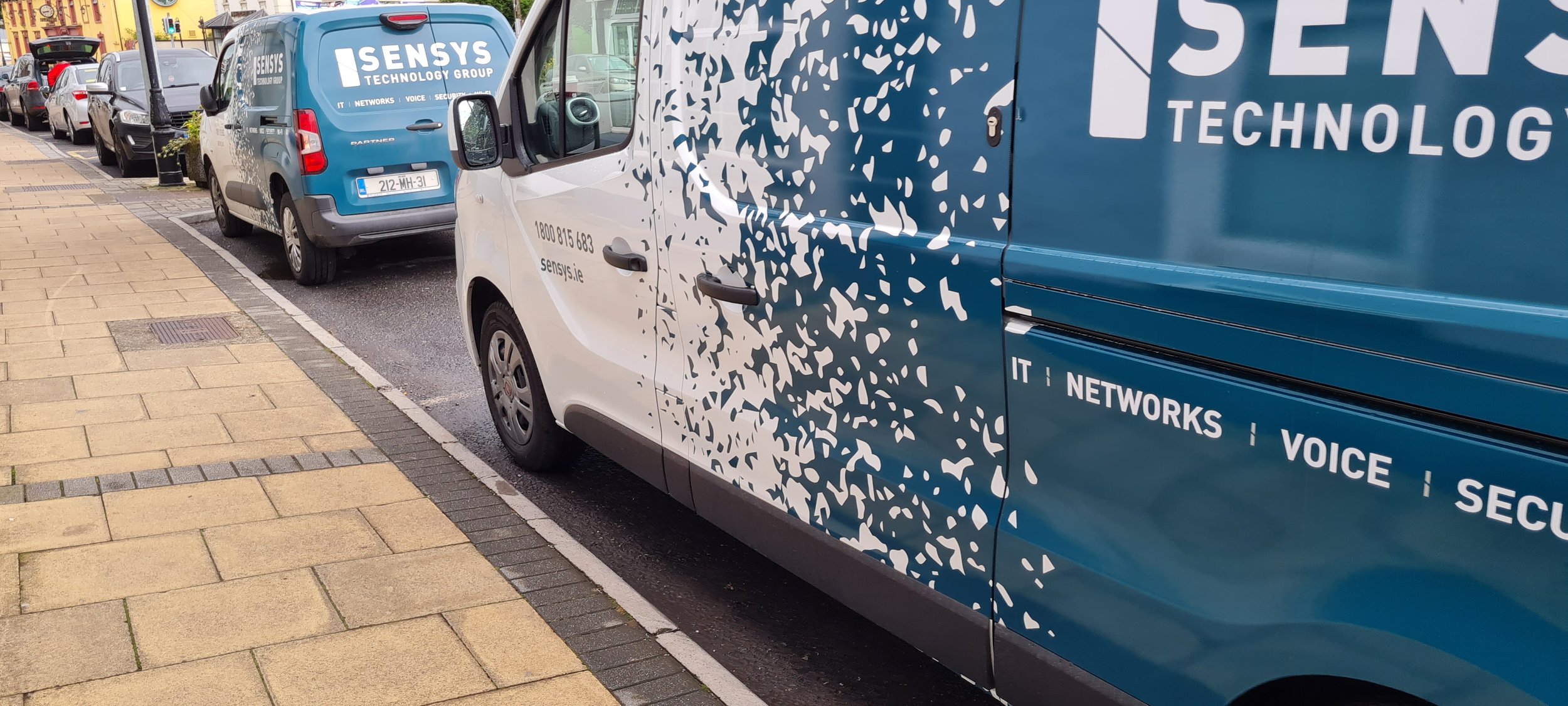
PRODUCT DESIGN
The brand also needed to be able to work with products. Both digital and physical. For one of these instances I designed a re-print for the SenSys Technology vans. These went through several design, until we found something that satisfied everyone involved. Below is an example of one of the earlier mock ups. And images of the end results; printed and wrapped around a dozen different vans.