

KILLEEN ENGINEERING REDESIGN
SUMMARY
Killeen Engineering needed a complete redesign of their website. This then led to a soft rebrand of the company itself, but not an over haul of the branding or guidelines. The new design would focus more on imagery and pops of the Killeen colours. And, most important, aiming for a more mobile orientated clientele.
PROBLEM
The design needed to take in to account that A) The backend of the website was not changing. B) had to include a ‘Gate Builder’ app, (whose premise at the time was vague). And c) mobile use had to be at the centre of the thought process.

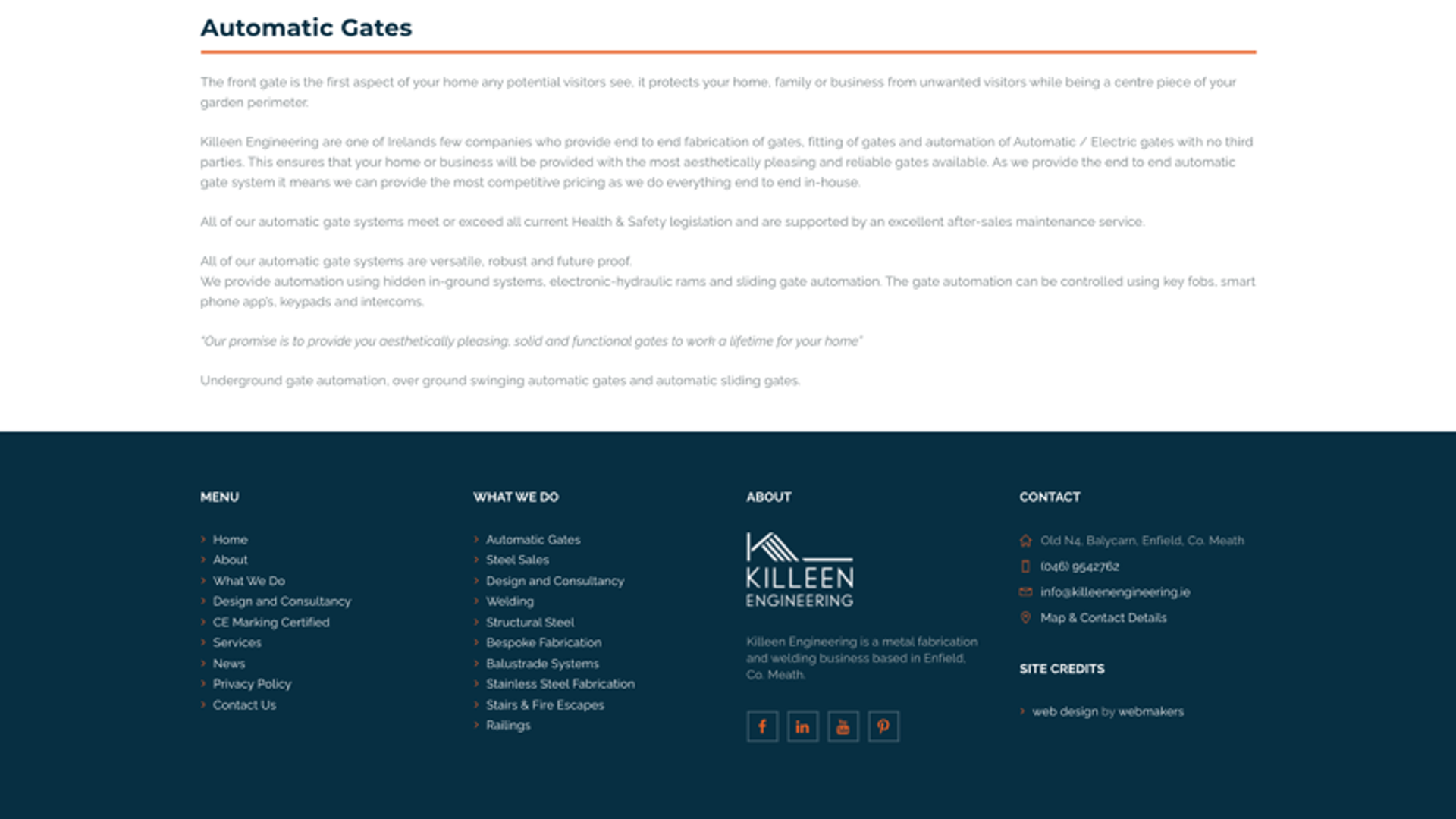
The site, as above, was originally styled as more of a traditional, template e-comm website. It worked, but did not stand out against competition. And, it is not actually an e-comm site, but rather a place to view products and book a quote.
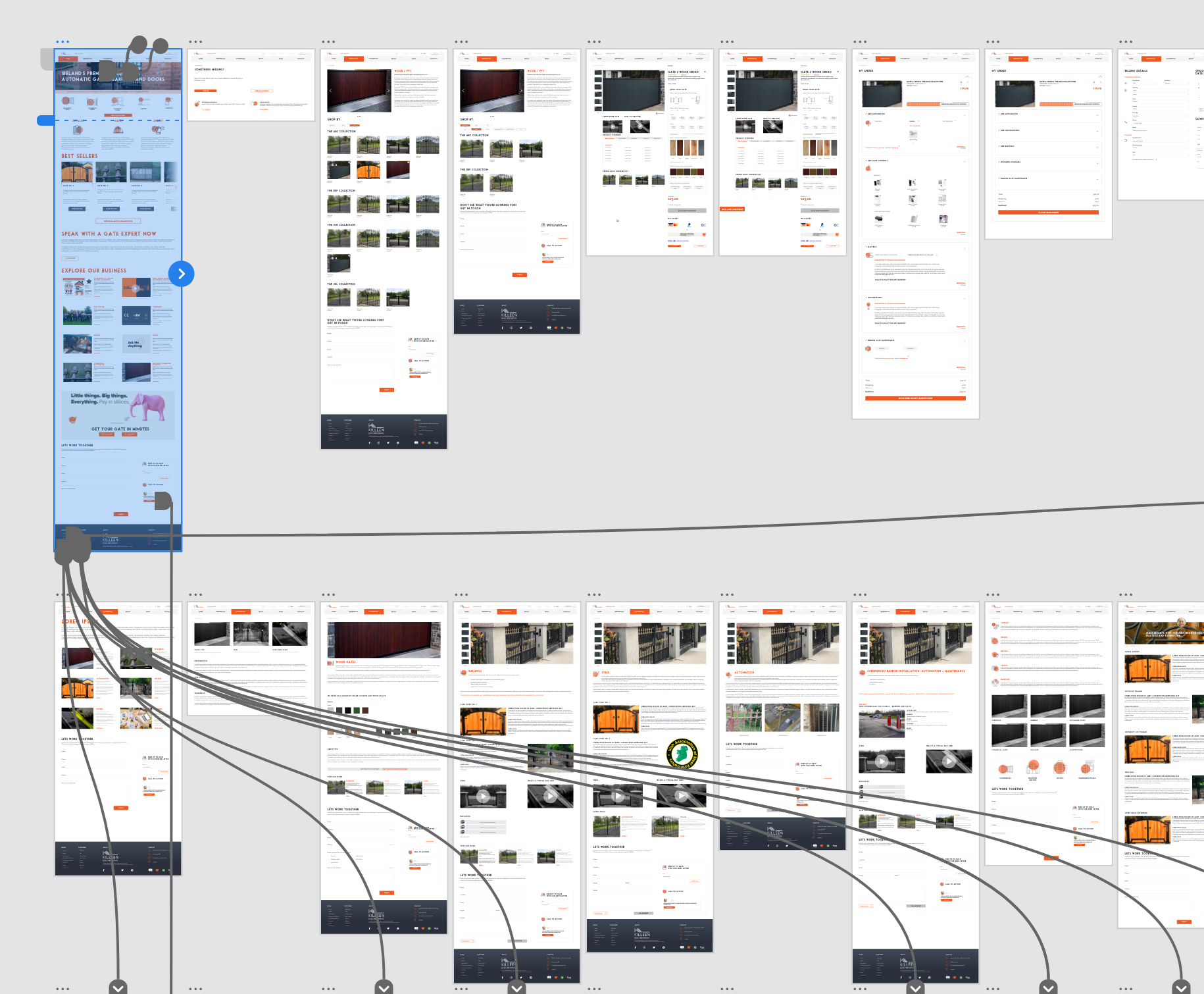
Understanding what the stakeholders wanted out of the new site was crucial. After discussing it from several angles, I was able to understand what their needs were. I then spent time researching competitor sites. I found that none of them had a website that really stood out. Items were in random places and design elements had been added as afterthoughts. Yet, the sites were also able to display a large amount of options via a mega menu.
Bearing these two things in mind (navigation + stand out design), I began to create mockups in XD. While most of the back end of the site had to remain the same, I was able to recategorise the products. Teaming up with the Salesforce and Marketing teams, we created a mega menu for Killeen. It would help categorise stock better. And create a quick, streamlined approach to creating a quote and booking.
DESIGN
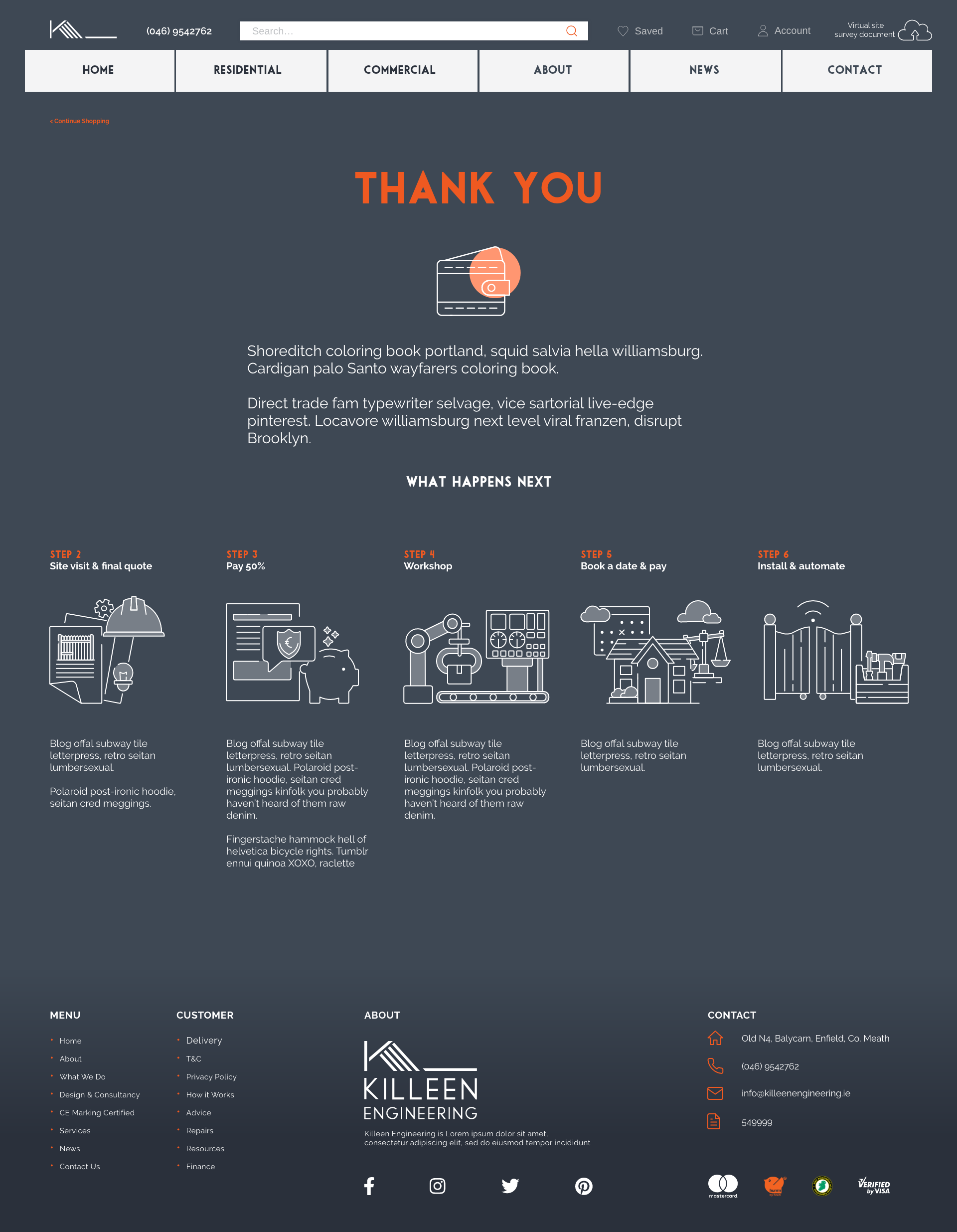
The original site suffered from being text heavy; making it difficult for users to navigate. Text heavy pages should not be at the forefront of this design. As we saw through testing that it was discouraging people from using the site.
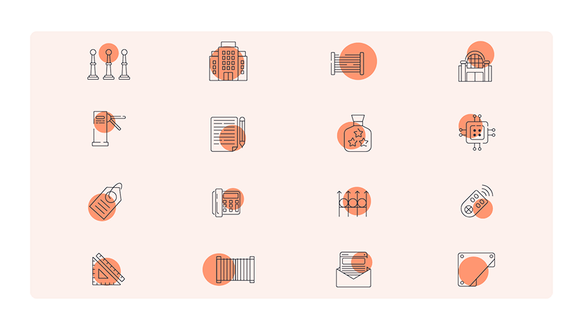
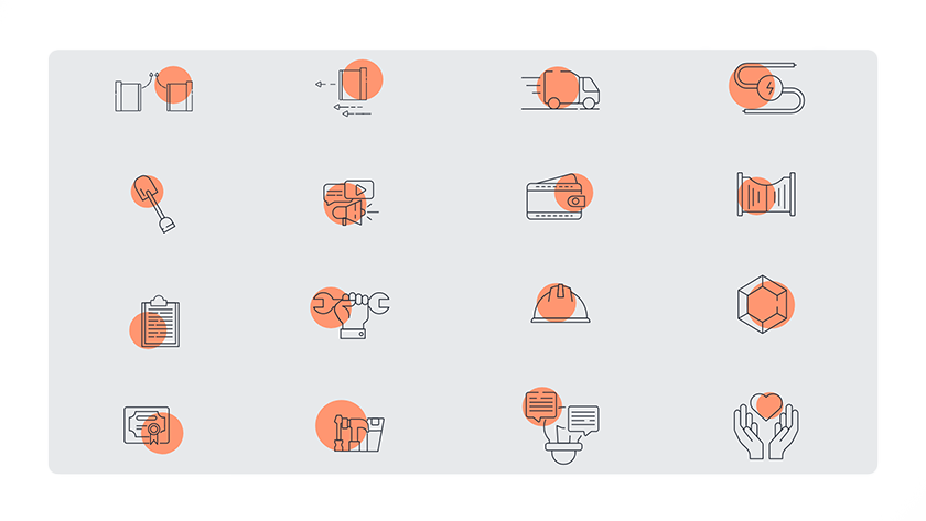
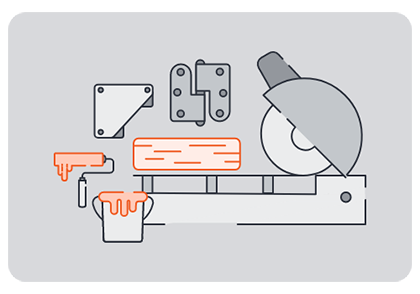
I created various icons to help display different meanings. ‘Bollards’, ‘turnstiles’, ‘contact’, ‘design’ and so on were concepts considered for these icons.
A problem crept up. How do you convey that a) gates have a starting price? That, b) this price can vary a lot, depending on electrics and add ons? And c) the user can ‘buy’ a gate with a booking but there is no cash transaction at this point. I considered different options, as below, and A/B testing to see what worked best.

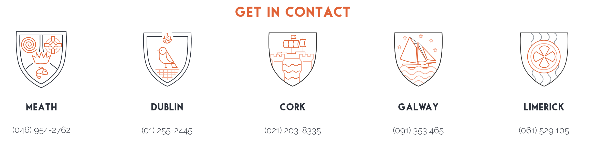
CHOOSING COLOURS
I was asked to continue using the pre-existing Killeen Engineering colours. But with free-reign to re-imagine their usage. All site design came from this idea. From switching to a white with orange pops identity. To prioritising photo images over icons where possible. And using custom, fun icons only where necessary.


BRANDING REFRESH
Keeping the new style in mind; I made similar design choices for brochures and literature. Clean, fun, easy to read and aided with visuals wherever possible.

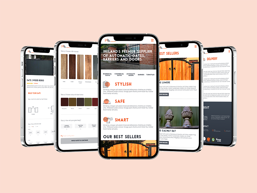
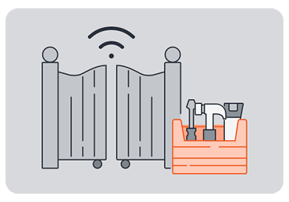
GATE BUILDER APP
Built into the website is a dedicated application for building a gate. Clients can choose various options and get an up to date price immediately. The costs built into this quote giving application are backed via Salesforce. Meaning it can be updated externally to the site. Due to this there was a limit on the UX capabilities.


MULTIMEDIA
Having a background in multimedia; I also made videos of staff members. These short ran through questions for each staff member. With the aim that potential new hires, or customers, could put a face to a name. I set up studio (camera, lights, audio) and filmed these videos in house. I then edited the footage after to create the above videos.