

CREATING THE SENSYS DESIGN SYSTEMS
SUMMARY
While working on rebranding SenSys Technology Group; I also designed separate websites for each of the 8 areas within SenSys. For the purposes of this case study, let's look at one of those sites; SenSys Security. The principle design for these sites is the same as the rebranding logic for SenSys Technology Group. Something that can work 8 different times. That is similar enough to be the 'same' as the others, but still unique enough that it holds up on its own.
PROBLEM
As with Killeen Engineering, the initial problem with this project was; the SenSys site already exists. A detailed back-end, tied to years worth of SEO and Google Analytics. I also needed to create a robust design system. One that could be flexible enough to be used in a variety of different services and softwares.
STEP 1: MOCKUPS
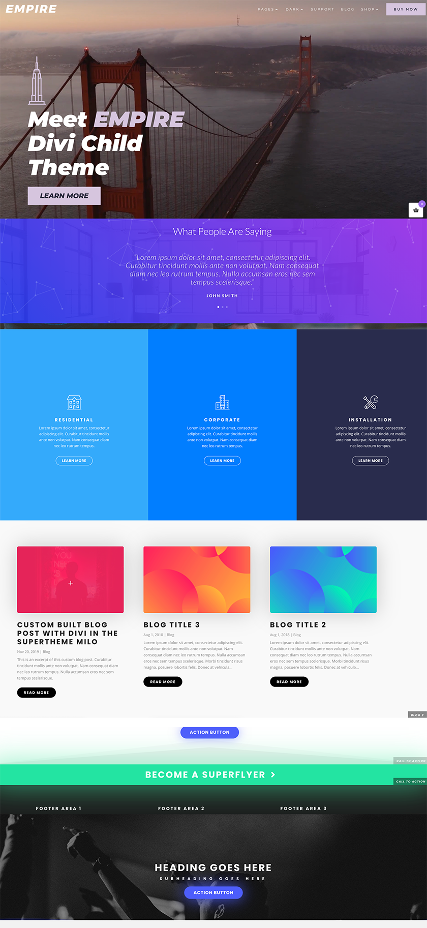
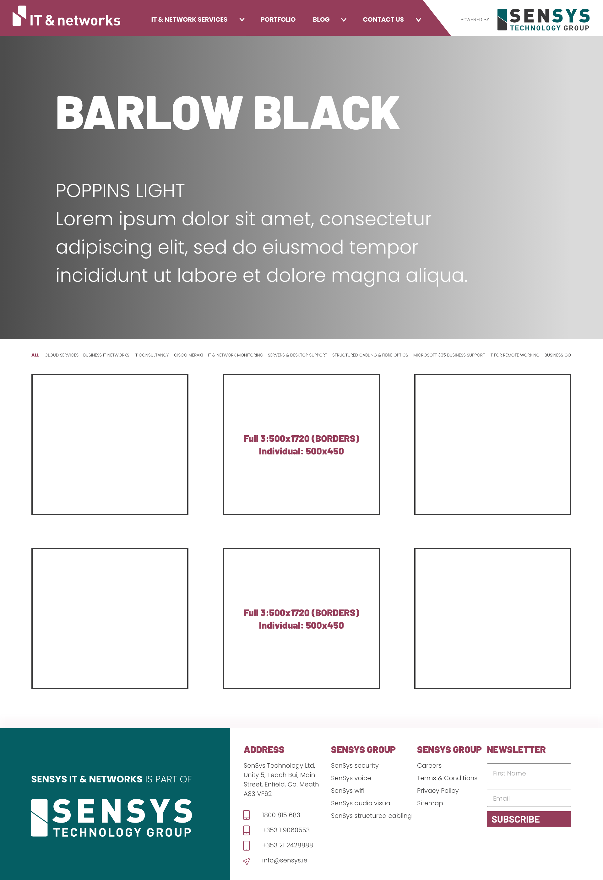
The developer for these sites requested that I use Divi - Wordpress to prototype the mockups. The original site used Divi and Gutenberg. So it made sense to keep those in place. Both add some constraints that needed consideration. The first image, is an example of a rough layout cobbled together through Divi. This was ‘the basic’ idea the owner requested. Happy to work with this ‘sketch’, I then began to mock up the blocks exactly in XD.
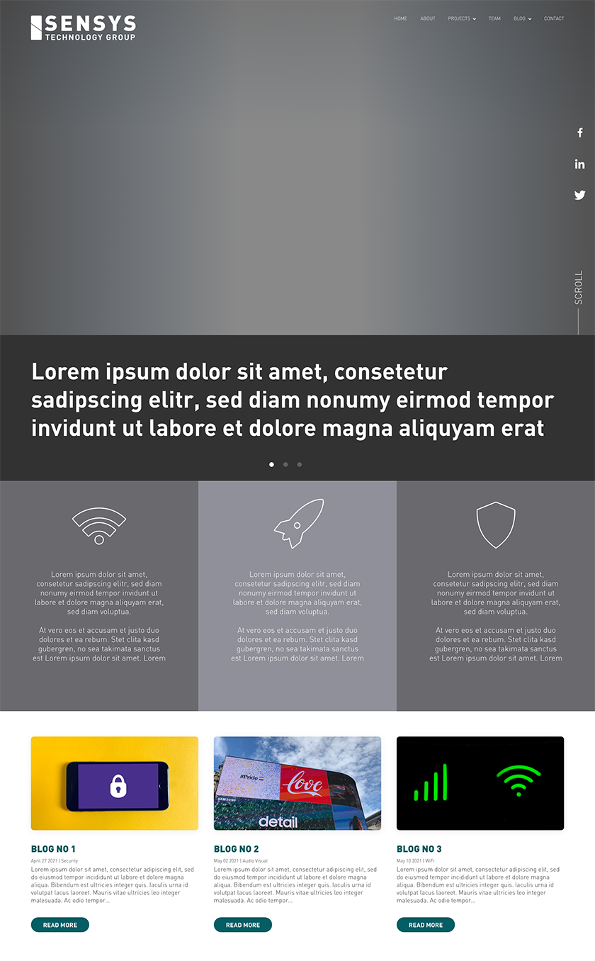
The second image is a more cohesive version of the first. Not having content or visuals yet, I kept to greyscale for the first review.
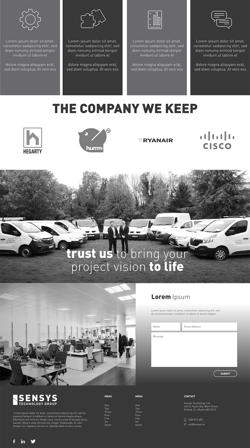
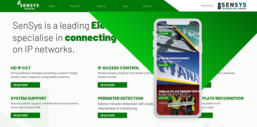
After the second image, the content was written and I was able to move on to the third image; the final review of the first mock up. We agreed that the second image was too busy, with too many rectangles. With 40% of all traffic coming from mobile phones, using large images was invaluable.


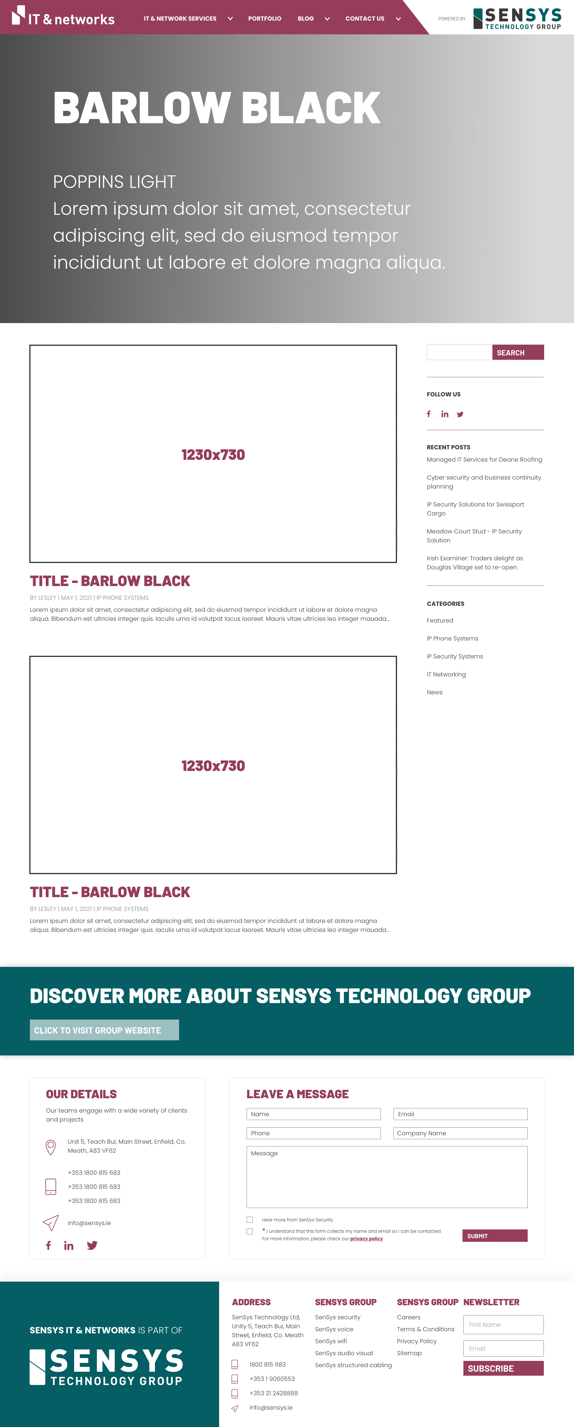
STEP 2: PRESENTING A BOLD BRAND
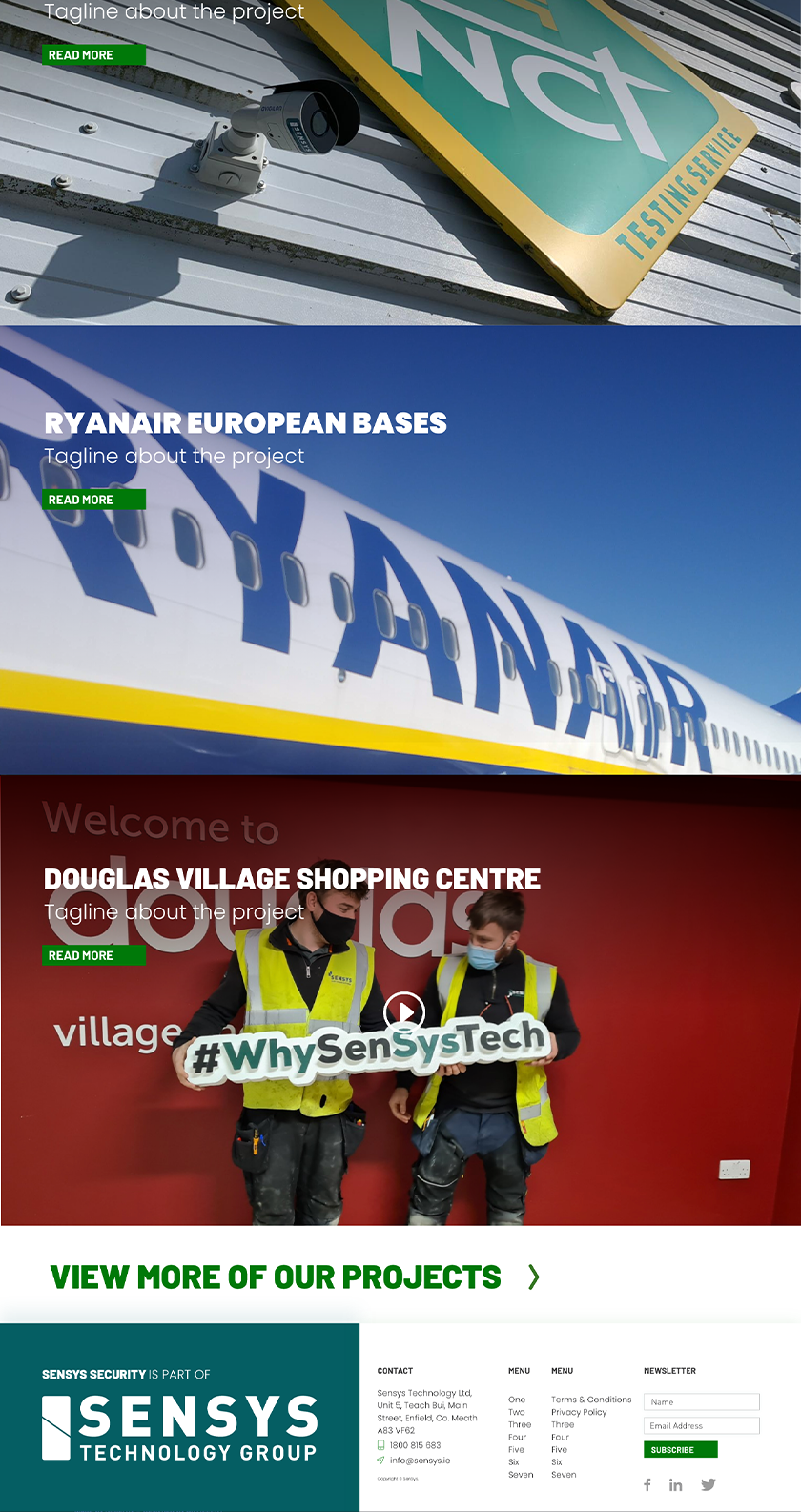
With the content acquired, I was able to move on to each individual page. Using the branding from SenSys Technology Group, I was able to develop and expand on it with this site. Keeping the main colour as SenSys Security Green, I made mockups for each individual page. Checking with the developer regularly, I was confident that the designs would work. I was able to prototype these designs until they were ready for testing.
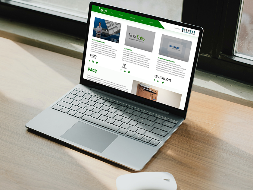
With testing, some issues became clear. The main question people asked was; How is the user supposed to know that SenSys Security is a ‘child’, of a bigger company? If SenSys is ‘Teal’, and the vans are ‘Teal’ and the uniform is ‘Teal’; would clients have a problem with technicians not wearing ‘Green’? Is the logo and name strong enough on its own? We decided to err on the side of caution.
The first way around this was to include links to the other sites, both in the header, footer and landing. SenSys Security was still the main focus I did not want the other sites to take the spotlight. Next, I added a split to the header. This allowed me to designate part of the header that was empty for a ‘SenSys Technology Group’ logo. I chose to make this area white, to make it stand out. Finally, part of the footer was also set aside for a similar image/colour.


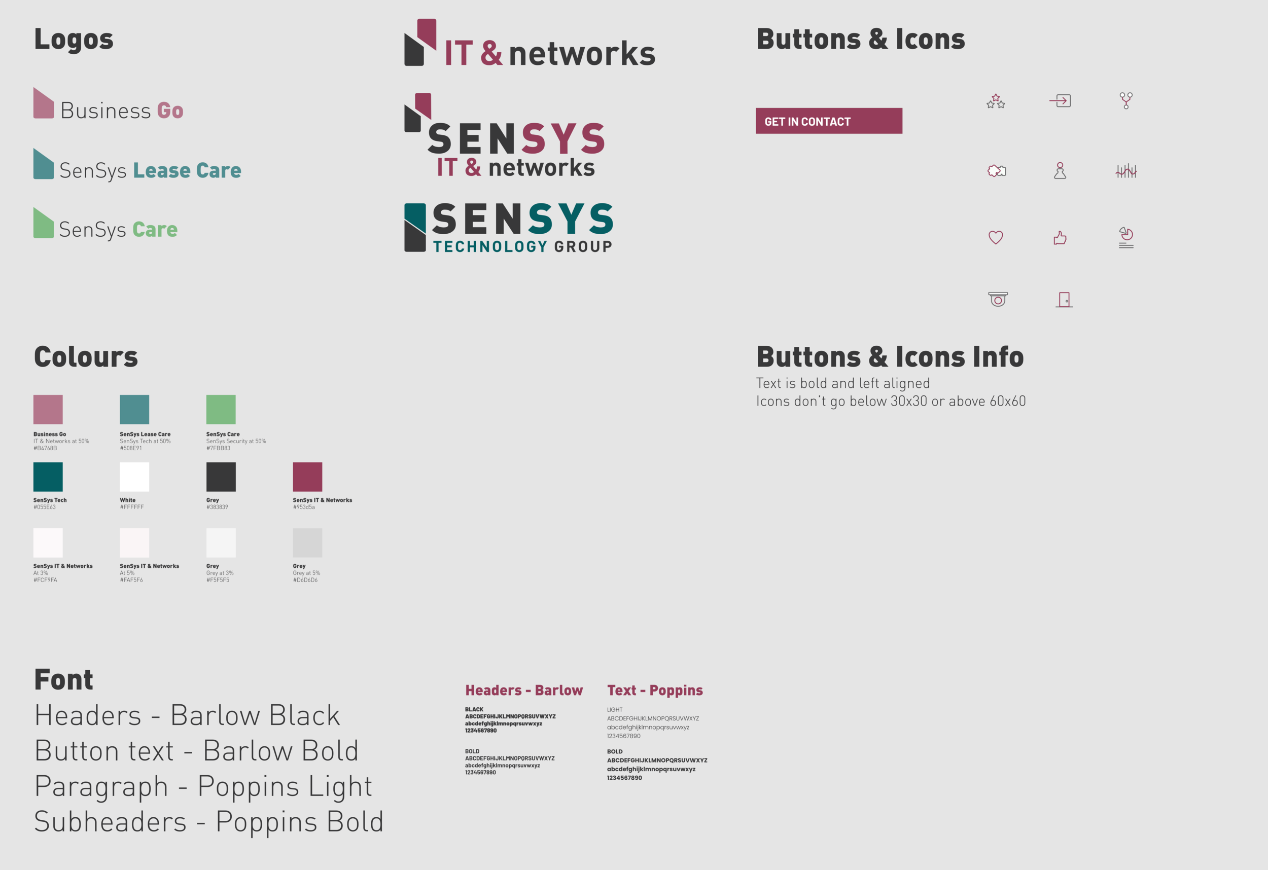
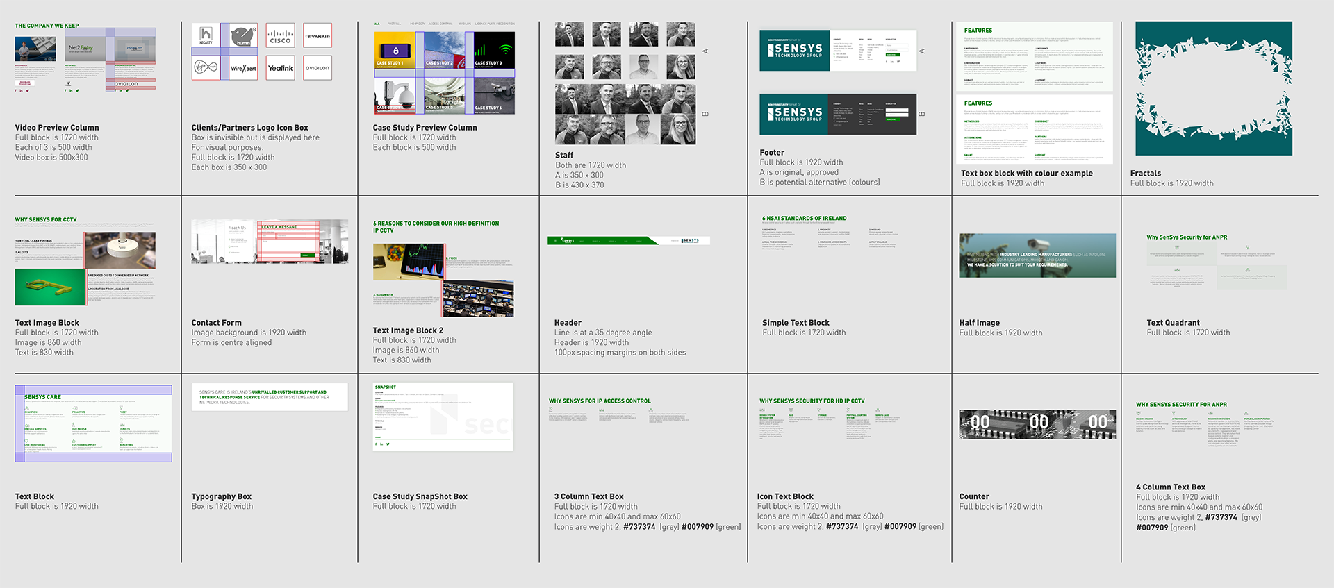
STEP 3: DESIGN SYSTEM
When the site’s prototype was complete, I began working on creating a design system for the developer. I created this in XD. It includes all dimensions, spacing, colour and fonts used throughout the site. It also includes minimalist versions of the SenSys Technology Group icons. Everything in the XD documents were made via components. I also set out instructions and guides on how each of these could be used.
STEP 4: FUTURE PROOFING
Using the components, I was able to create the follow up website in a fraction of the time as SenSys Security took. This helps the developer as well as they can create similar systems on their end.


MULTIMEDIA
I filmed videos for each of the main pages of the websites. We agreed that each page needs an overview video. These needed to be roughly 60 seconds long, with some exceptions being 3 mins.
I shot these videos, while doing the audio/lighting/filming myself. I then edited all the footage to create these videos. I also organised the scripts in advance, working with the heads of each department. I designed the thumbnails to fit in with the rest of the site’s design so that they do not look out of place.